Whatever it is you want to achieve it’s a no brainer that you must be willing to put in the work. But what if … There’s no BUT you just do so stop reading and start doing.
You’re welcome.
Whatever it is you want to achieve it’s a no brainer that you must be willing to put in the work. But what if … There’s no BUT you just do so stop reading and start doing.
You’re welcome.
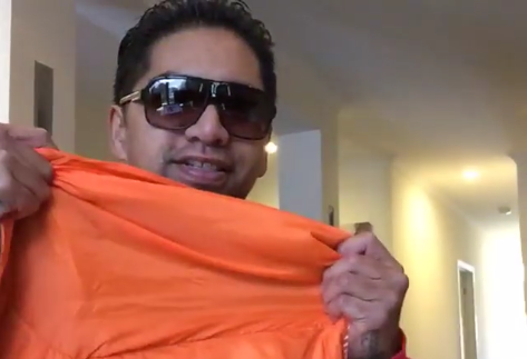
For the last few days I have been working on a project I can do to help the homeless and I came up with this Sleeping Bag giveaway.
The idea is to give out as many sleeping bags as possible to those that need them and every so often swap them out for clean ones while I take their current one to be washed. I just wanted to do something as quickly as possible.
So here’s my ‘thing’. Like all self funded projects I just need some money now but for the time being I’ll buy as many as I can whenever I can and just get out there.
Start somewhere, start now.
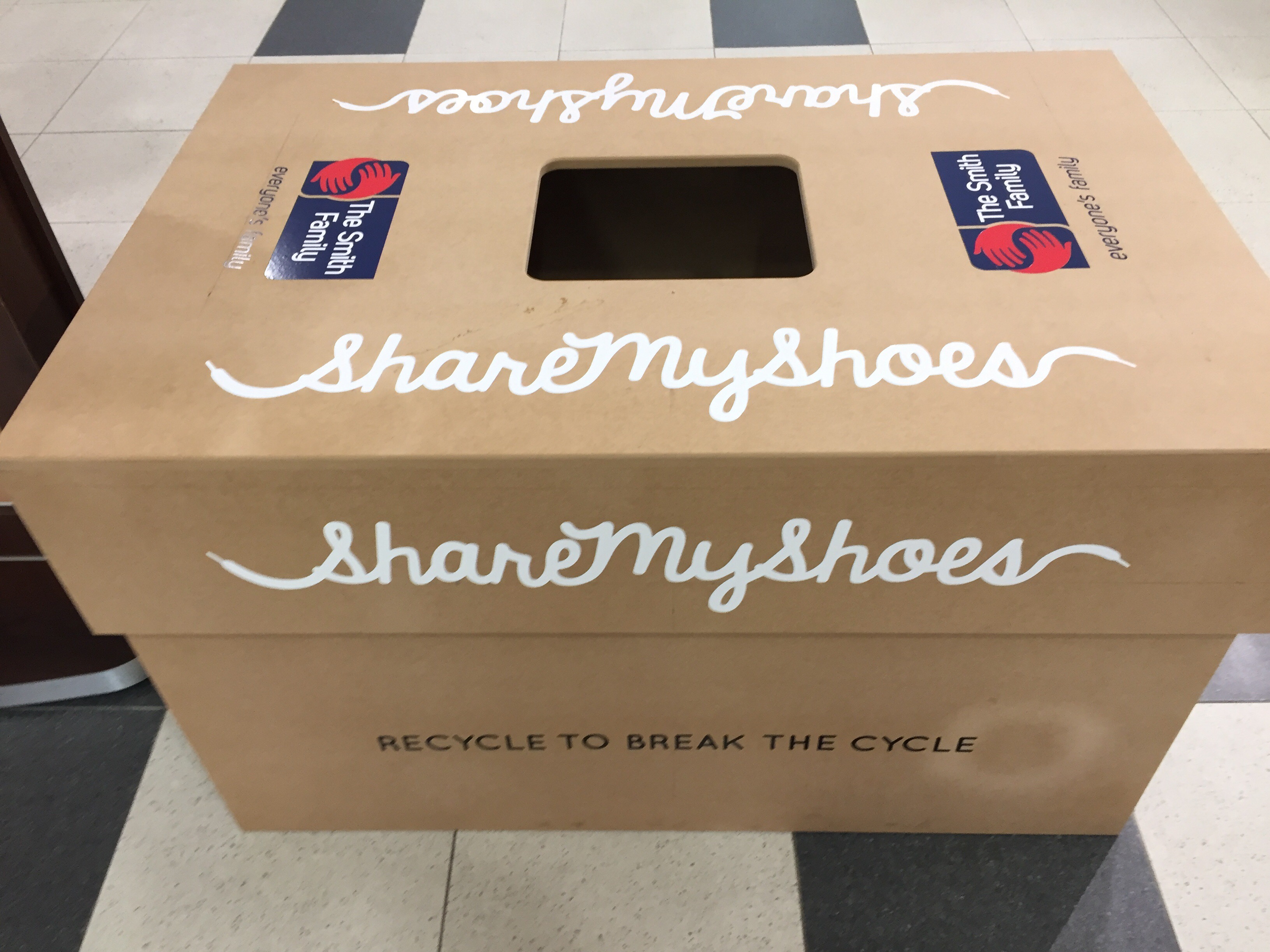
I saw this in Moonee Ponds yesterday:

To help the less fortunate.
You can’t really tell by the picture but the box is huge which initially caught my attention.
Then I got to thinking, I’ve got so many pairs of shoes and have been planning on giving most of the away. But I’m not sure I want to do it this way, I want to look the person in the eyes that I’m helping.
Pretty cool initiative setup by The Smith Family though.

The plan was to meet up with Dre, find him some temporary accommodation and make him some money. And this is what happened:
A few months ago I started blogging and I’ve stumbled across a few minor issues using WordPress. The most recent being that embedding YouTube videos can be a pain because depending on what platform you view them on ie; mobile, tablet or desktop they don’t resize automatically and ruin the user experience.
I looked at a few YouTube plugins but the time lost searching through them to filter the free and paid versions did my head in. So I put some code together and BAM here is how to make your YouTube videos responsive:
You will need to wrap the responsive YouTube embed code with a <div> and specify a 50% to 60% padding bottom. Then specify the child elements (iframe, object embed) 100% width, 100% height, with absolute position. This will force the embed elements to expand fullwidth automatically. Awesome! Exactly what we need.
First you will need to add the following to your style sheet.
.video-container {
    position: relative;
    padding-bottom: 56.25%;
    padding-top: 30px; height: 0; overflow: hidden;
}

.video-container iframe,
.video-container object,
.video-container embed {
    position: absolute;
    top: 0;
    left: 0;
    width: 100%;
    height: 100%;
}
Next, add some HTML around your embed code.
<div class="video-container">
         <iframe src="http://www.youtube.com/embed/dFVxGRekRSg" frameborder="0" width="560" height="315"></iframe>
</div>
If the responsive YouTube embed worked, your videos should be responsive, and ready to view on Tablets and Mobile devices.
If you have any questions then holla at me. Peace.